Logo

Our motto is – WE ARE OPEN TO THE WORLD!
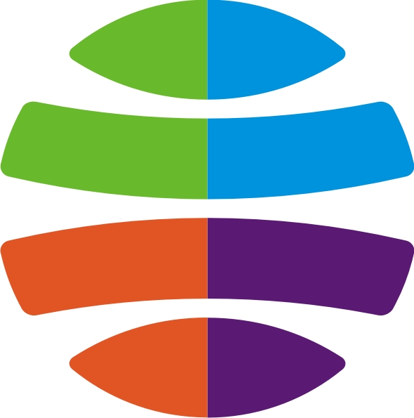
The graphic symbol (trademark) represents the stylized image of the globe, visually divided into four segments. Each of segments of the symbol is broken in half by different colours. The abbreviation and full name of the University is placed to the right of the symbol.
The symbol is a typical and recognizable representation of the planet. Segments of the globe symbolize different fields of study: green – ecology, blue – air space, lilac – natural resources, and orange – Earth subsoil. Thus, the symbol represents various fields of Earth study.


